
This is one of the very first case study that I worked on, the idea was generated from a Sharpen prompt as part of the Google UX design certificate course that I completed recently. I have not used Figma extensively before and I thought this would be a good exercise for me, plus I liked the idea of working with food images.
Project Duration: May 18 - June 9, 2021
Project Overview

Summary
I created an online custom food ordering app for a restuarant called Familia Restuarant to attract and retain customers in their online systems. It is created to compete with other similiar mobile products that have been shown to be successful. I wanted this product to be compatible in the markets, improve sales and increase customer satisfaction.
Tools Figma, Photoshop
Research Study Details
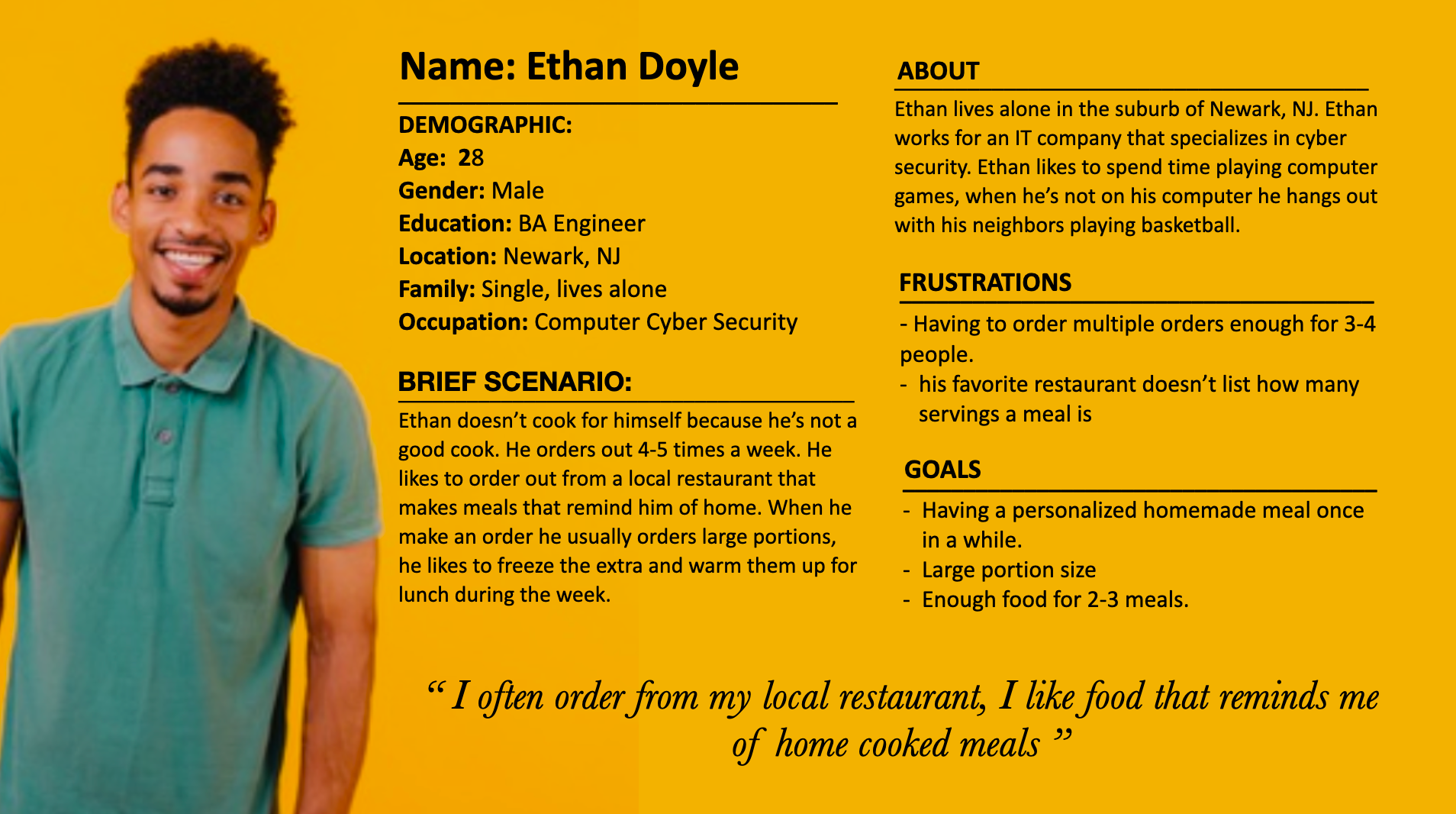
Personas
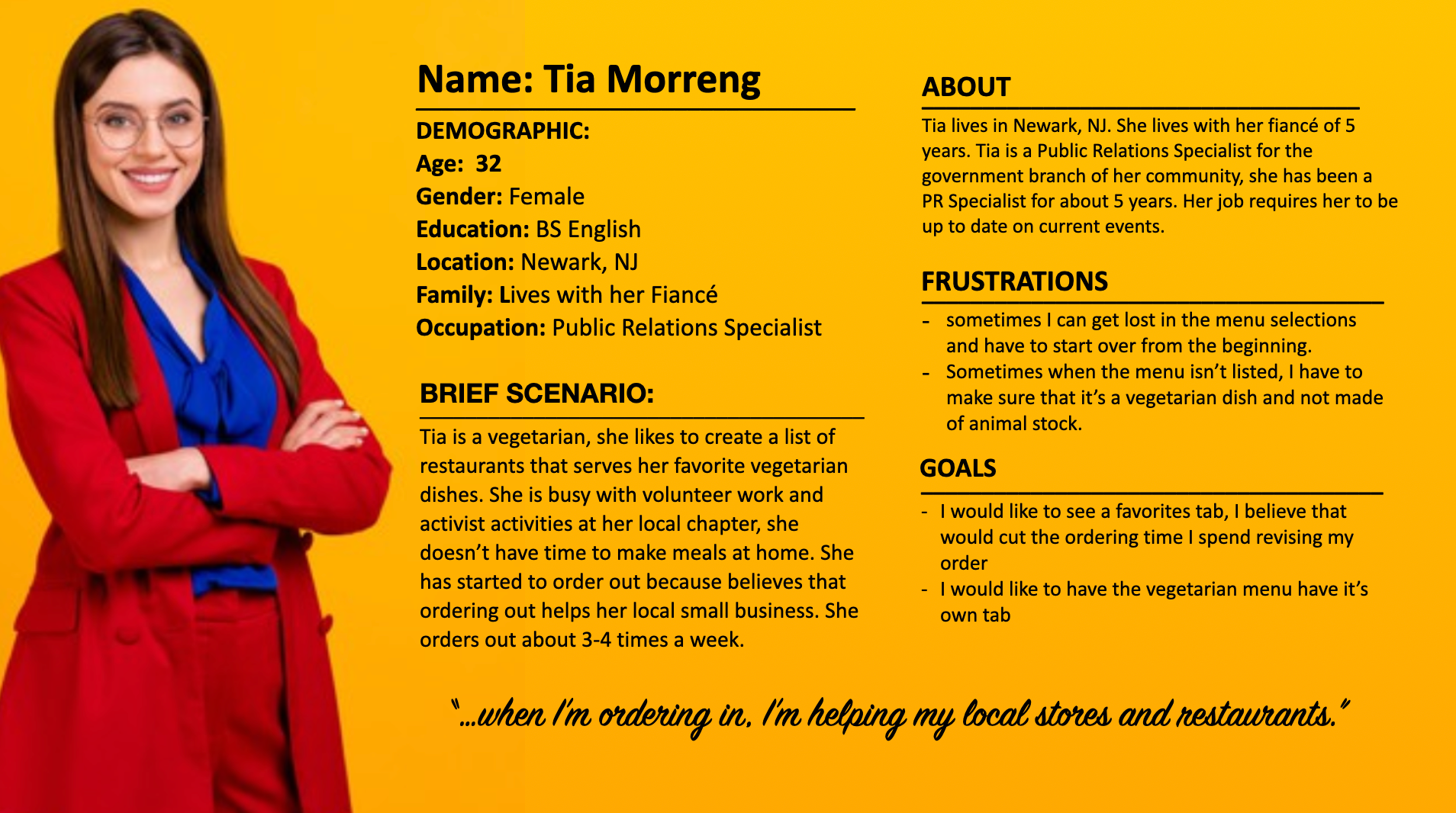
Persona: Tia
Pain Points


Let's Ideate!


Crazy 8 Exercise
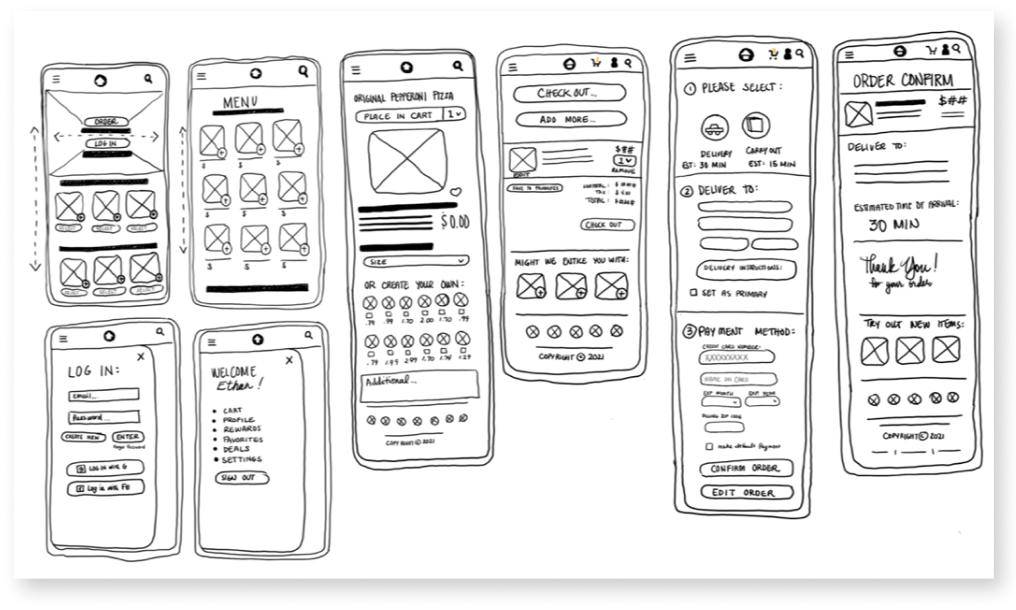
Paper Wireframe
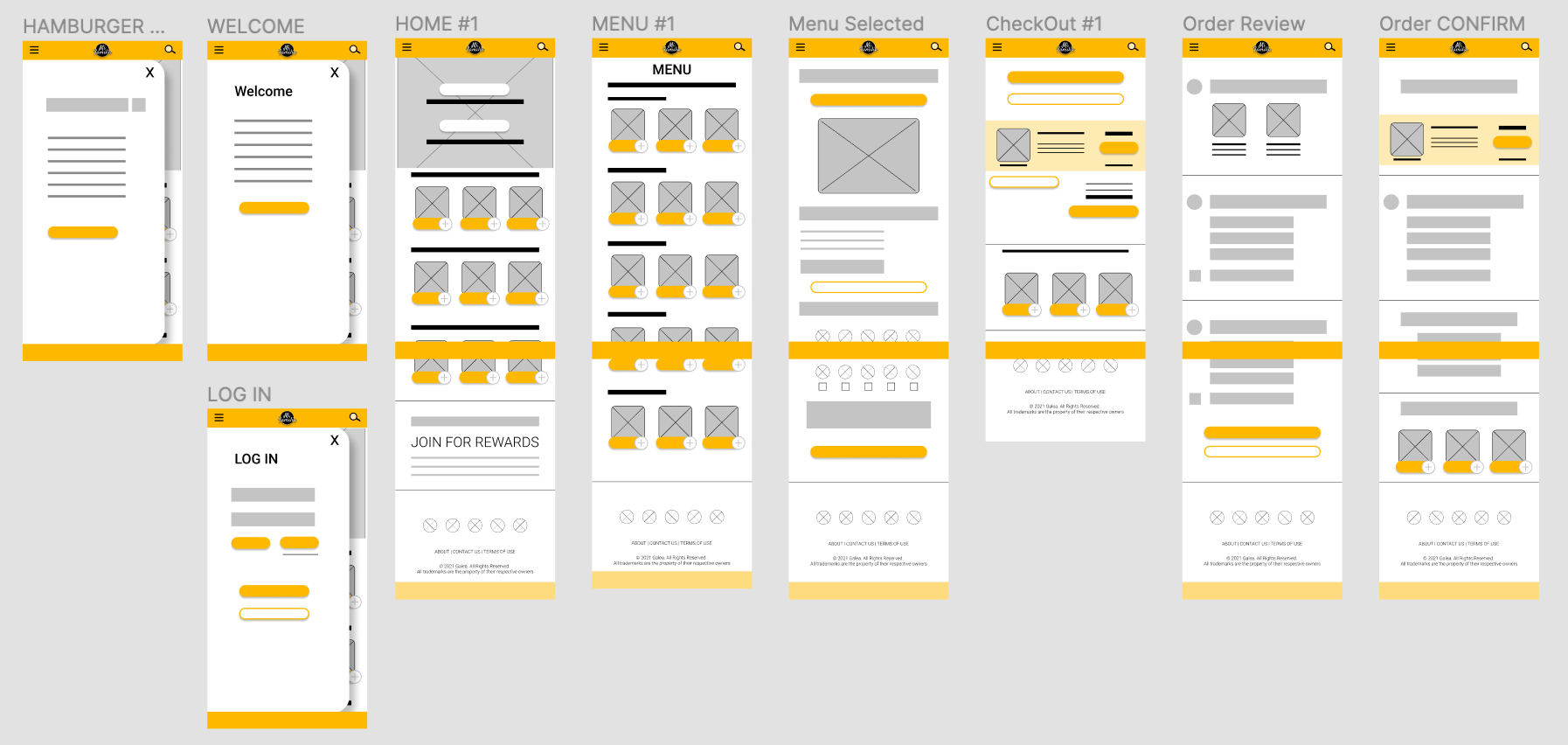
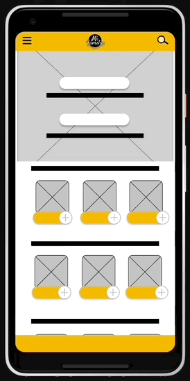
Low-Fidelity Wireframe
While creating the low-fi wireframe, I wanted to keep the design simple and easy to navigate. I also wanted to keep the images/visuals consistent throughout the site so that the branding is recognizable when transitioning from page to page.
Low-Fidelity Prototype
Low-Fidelity wireframing
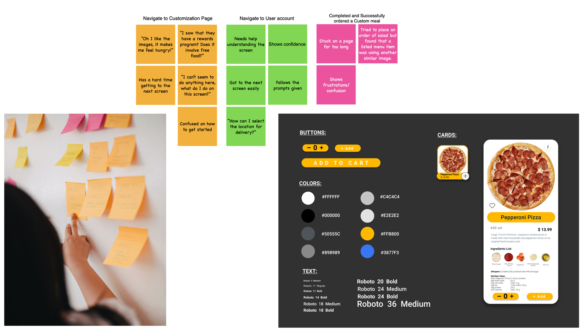
Usability Studies
Time on task measures how long it takes users to complete a desired action. The conversion rate measures the percentage of users who completed a desired action.
A system usability scale, or SUS, is a questionnaire to measure the usability of your designs. With an SUS, users are asked to agree or disagree with ten statements about the usability of a design. It's a quick and reliable way to know if a design is working.
Using these study methods I conducted my research study and found key points and design directions that helped me focus on a direction for this project.

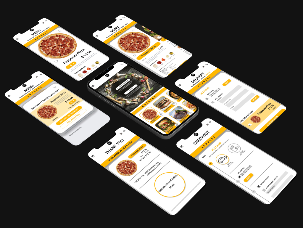
Mockups & Prototypes
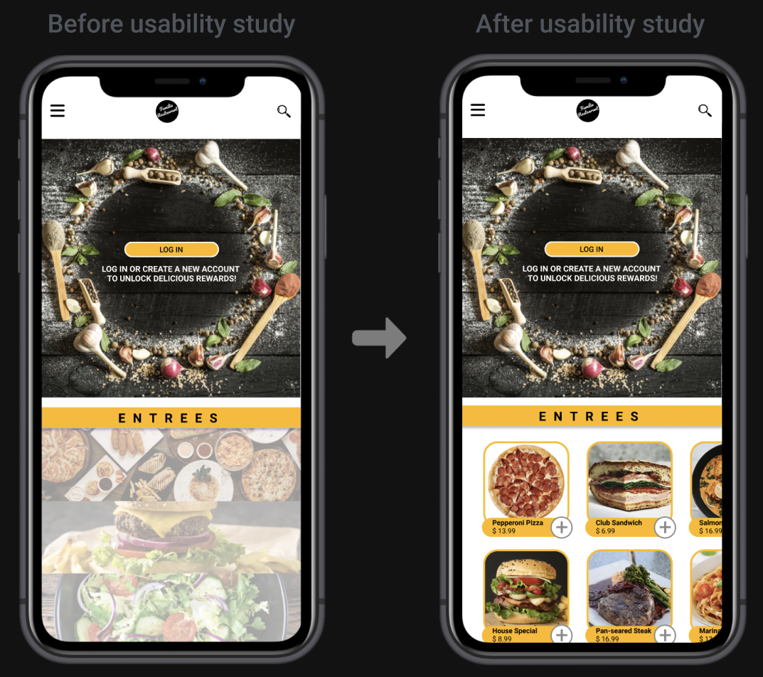
I wanted to create an app that was esthetically and visually pleasing to look at with bright, fresh visuals that would stand out. I also wanted it to be accessible for users who were not familiar with ordering online, so I incorporated hierarchy types and defined boundaries to create clear separations.
Accessibility Considerations
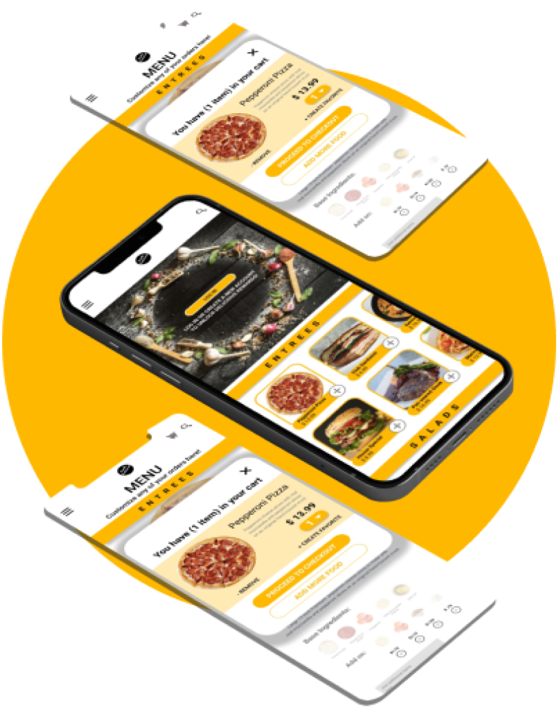

High-Fidelity Prototype
High Fidelity Prototype Video, press Play.
Project take aways

You've reached the end. What's Next?