
The premise of this project was to choose a design prompt from the Sharpen prompt generator.
The prompt that I selected for this project was to “Design a flower arrangement customization flow for a florist in Seoul, S. Korea.” Instead of coming up with a made up company, I went online and searched for existing floral shops in my local area that could use a little bit of touch up or an update. I did find a couple floral websites, but I settled on this one; Specialty Floral in St. Paul, MN.
Project Duration: June 28, 2021 - July 12, 2021
Scope: UX Design, wireframing, rapid prototyping, user testing and strategy, in charge of the design process from conception to delivery. Conducting interviews, paper trails and wireframing, low and high fidelity prototypes, conducting usability studies, accounting for accessibility, iteration design, determining information architecture and responsive designs.
Tools: Adobe XD, Procreate
Key Challenges / Constraints: The challenge was to add a Flower Customization option and to reduce noise of the original website, condense information, simplify features and make the site engaging, intuitive and easy to navigate.
The Goal of the Project: Ideating a custom modal with tailored options and interactive map API, I hypothesized that users will find the new design more engaging and personal, thus visiting more spaces in search of their ideal custom order.
Target Audience: The typical user is between 20 -75 years old and most are professionals and/or romantics looking to brighten up their spaces or buy something nice for themselves or a loved one.
Re-Design Strategy
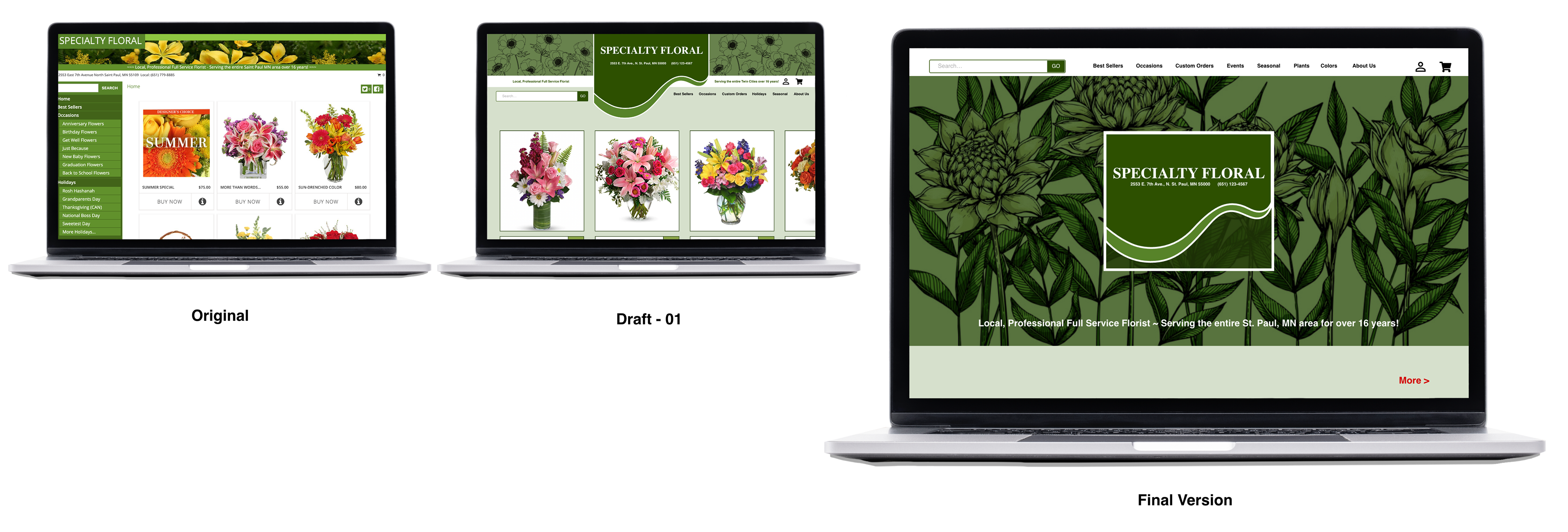
I researched new design trends for online floral shops and I found that new designs for floral shops consist mostly of an enlarged hero image and less words. I designed this site according to what I viewed as currently trending and decided on the color palette based on the colors already used on the site. I wanted to include in the design a clean surface, refined details and powerful options, using custom elements and refined colors for showcasing gentle flower images as a source of inspirations and relevant information. My aim was to create intuitive organization and dynamic details to make a perfect choice for florist design.
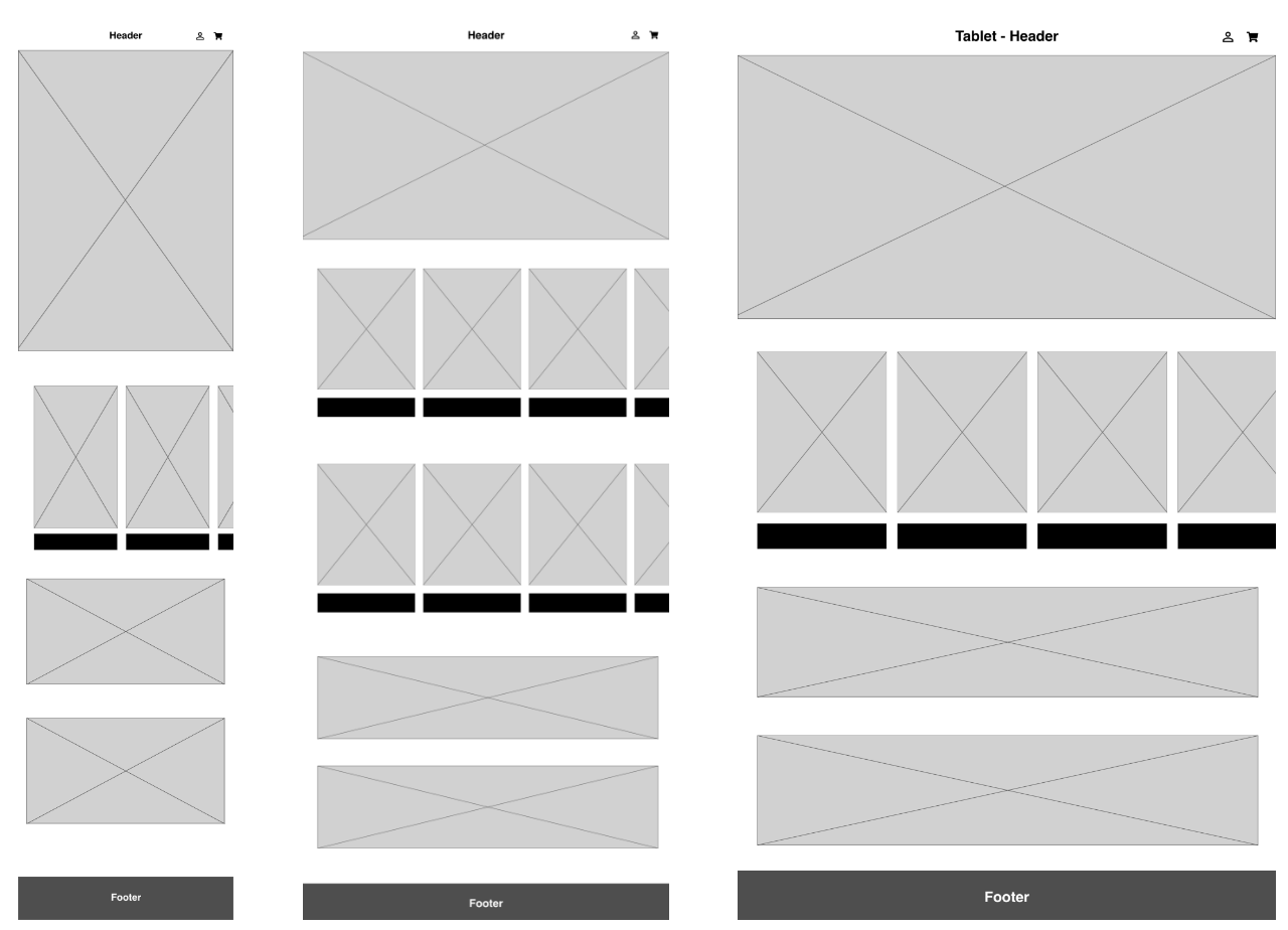
I started off with drawing out the paper wireframe to put down the basic components and focal points. In reviewing the current website there wasn't a clear definition of a hierarchy navigational flow, so I wanted to make ensure that I focused on creating a hierarchy of design so that the users navigation through to the customization process is easy.
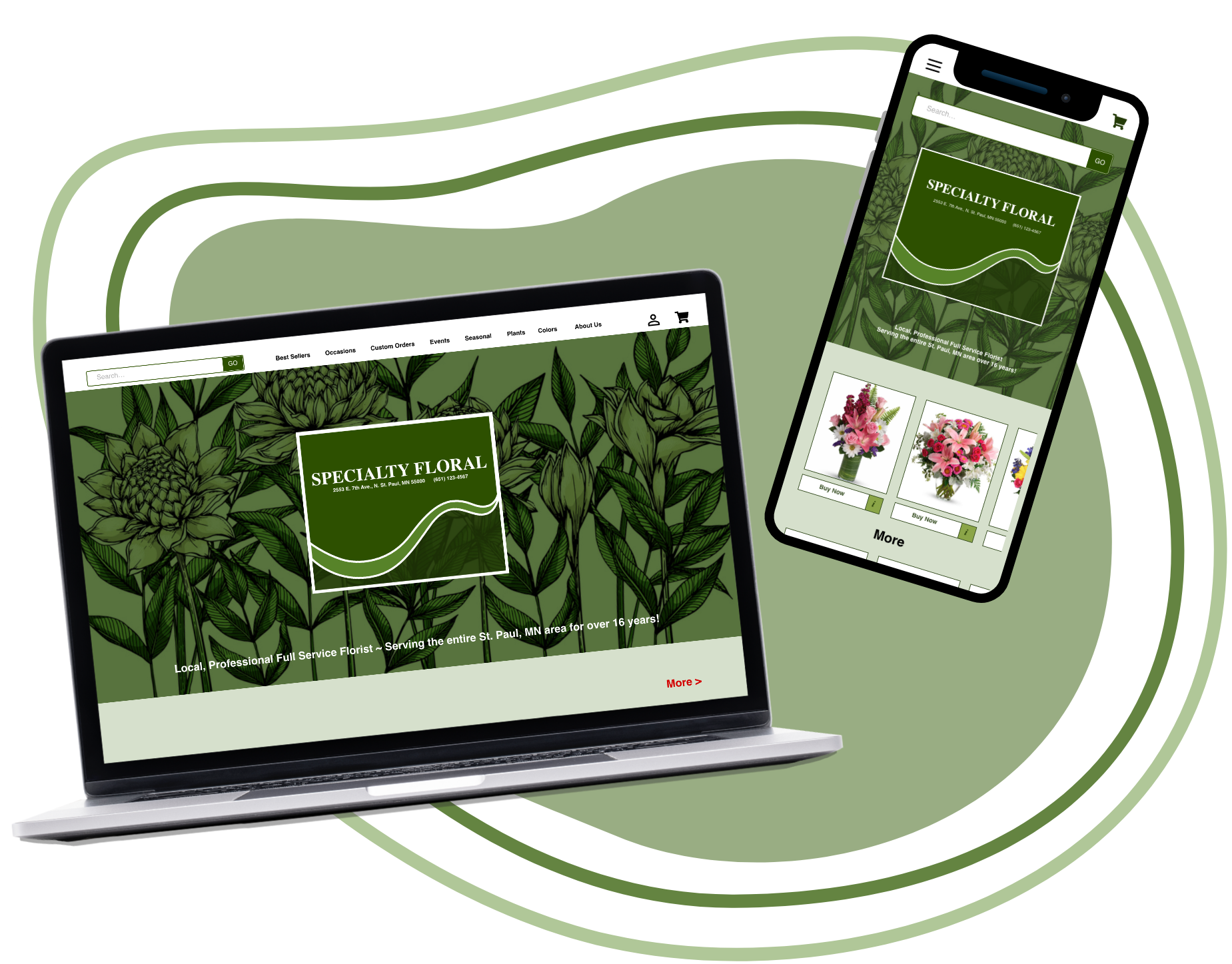
Existing pages for Specialty Floral
Below is a screenshot of both the current existing website and mobile.

Existing screenshot of Specialty Floral Shop website
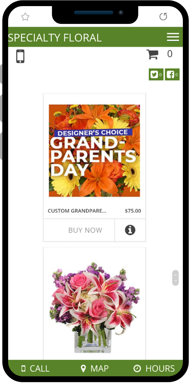
Existing screenshot of landing page of Specialty Floral, mobile version.
The Proposal
1) Change the layout and design
2) Allow for more options
3) To order a custom design, users can now choose to indicate color, flower and quantity or call the shop directly.
Ideation

Various idea explorations:
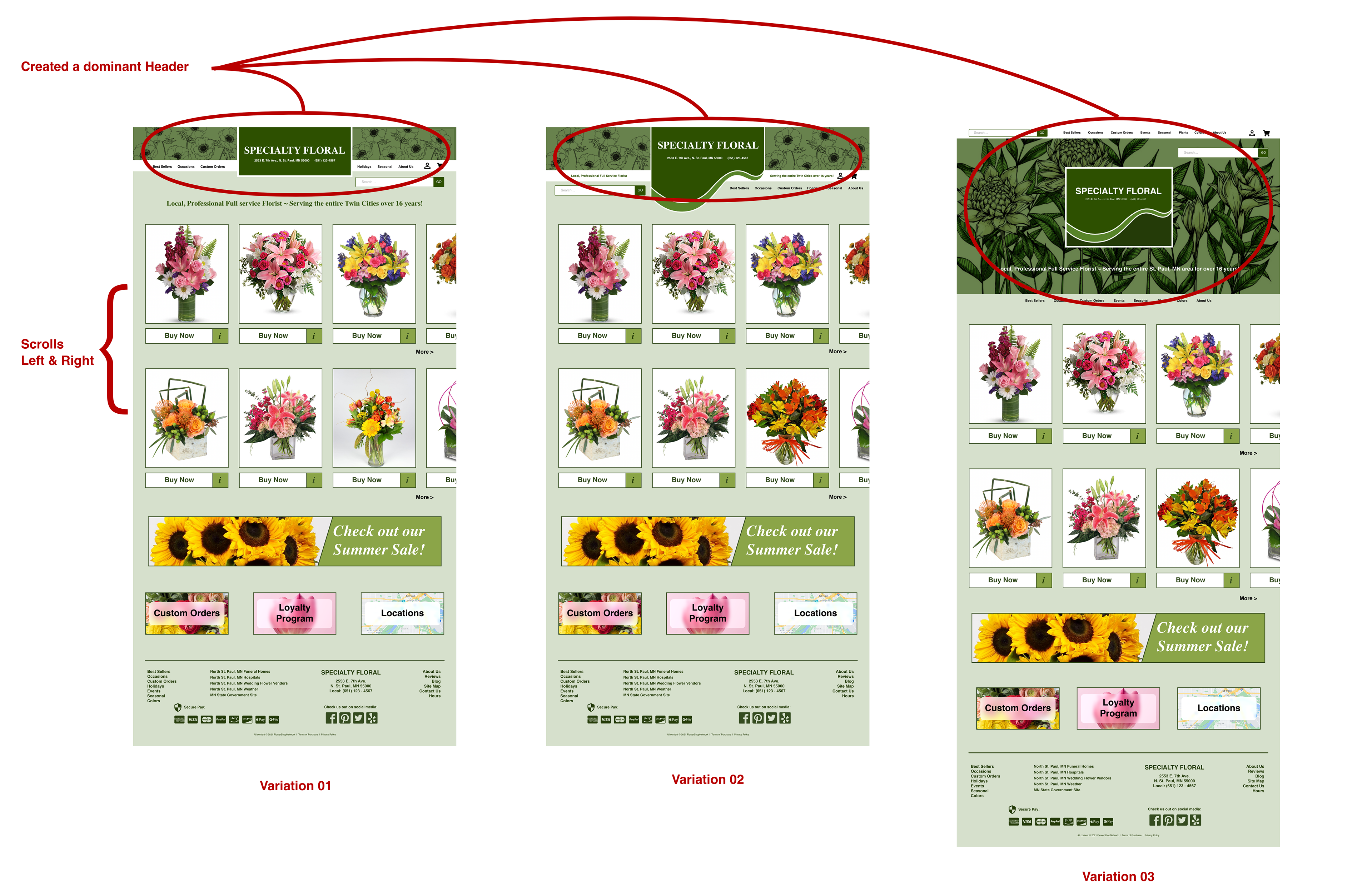
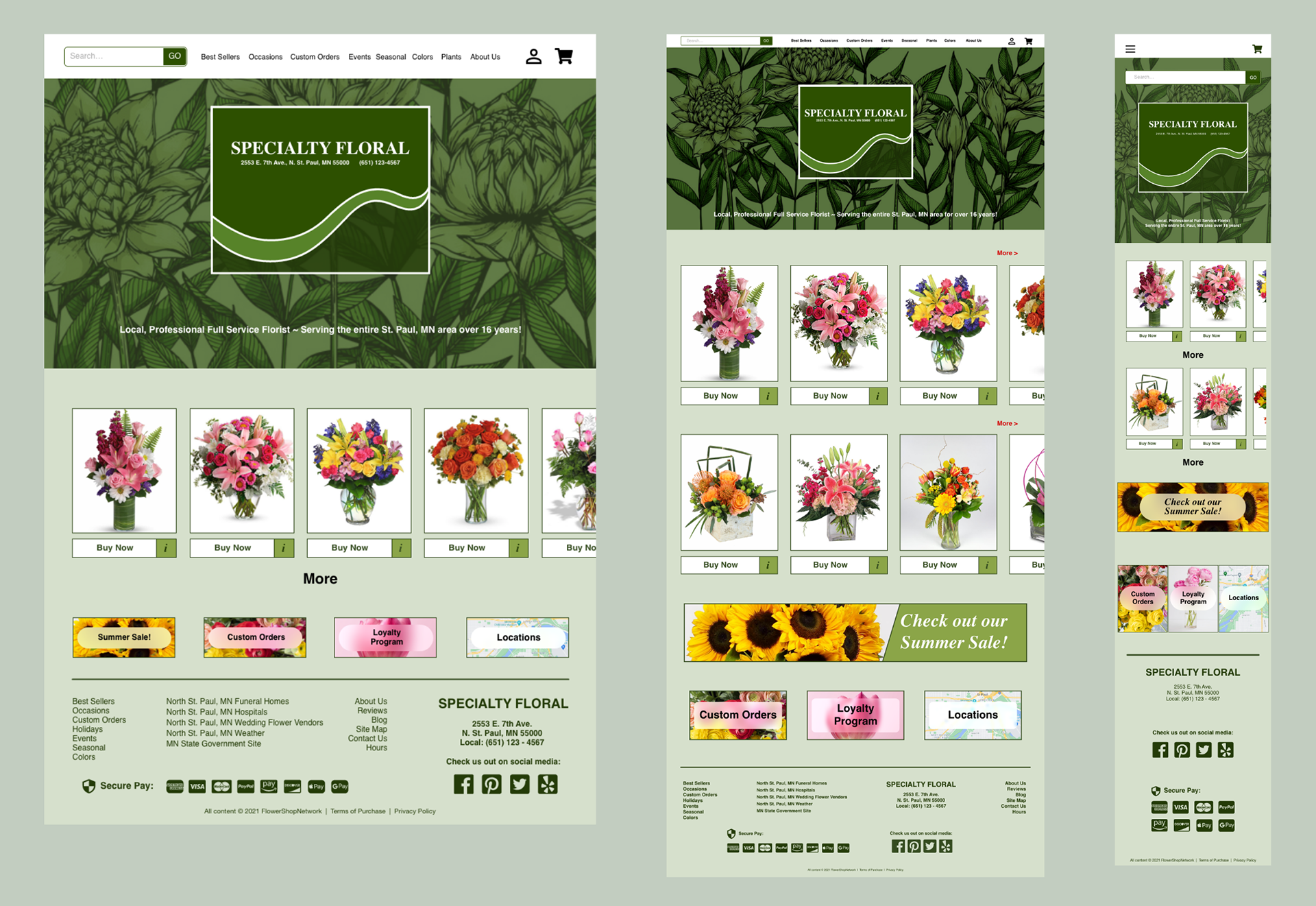
I went with Variation #3; in this version the larger hero image serves as a landing page which gave it a sense of hierarchy and gives users a starting point. In all the variations I included scrolling product images, my idea was to minimize space by doing so and showcase more products.
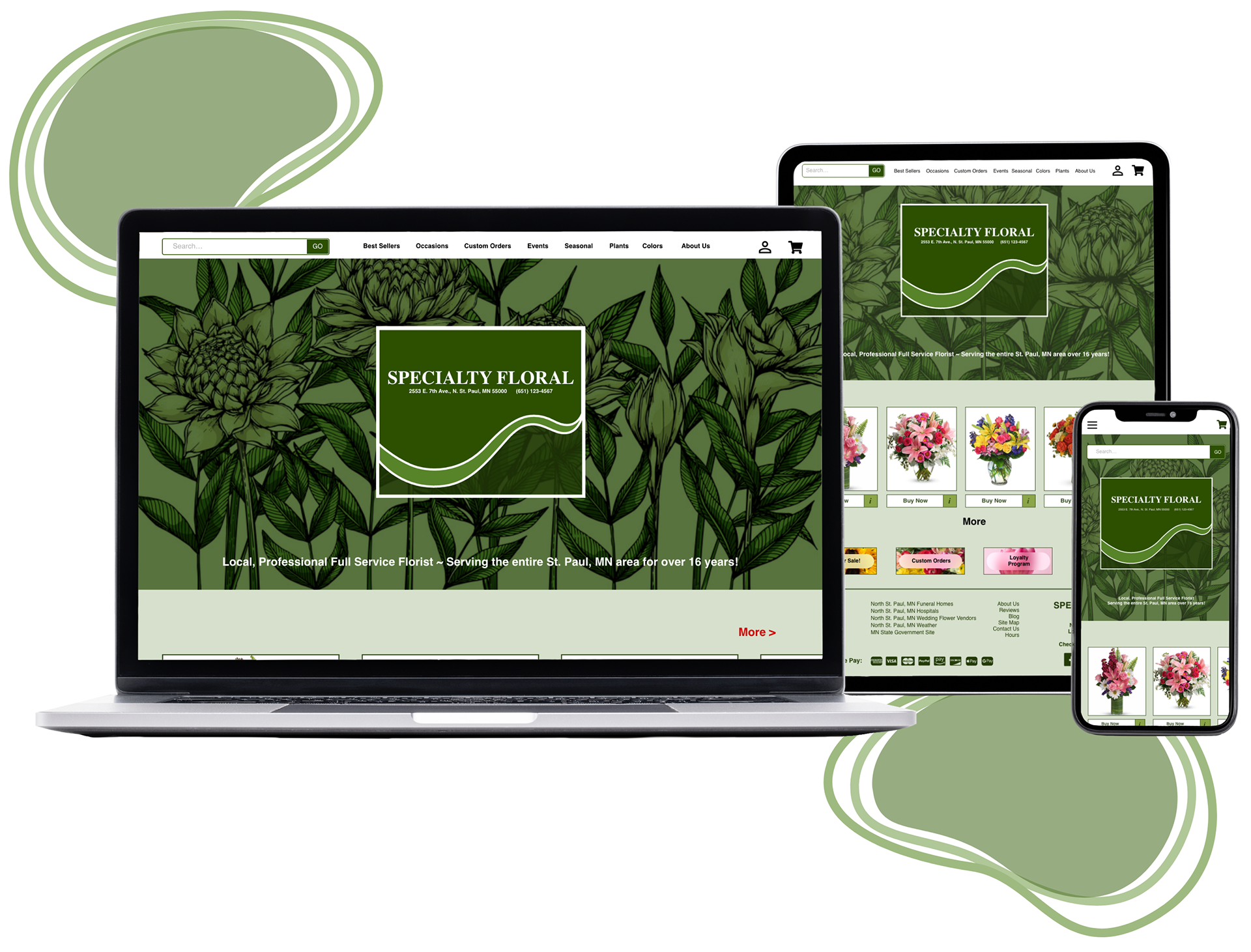
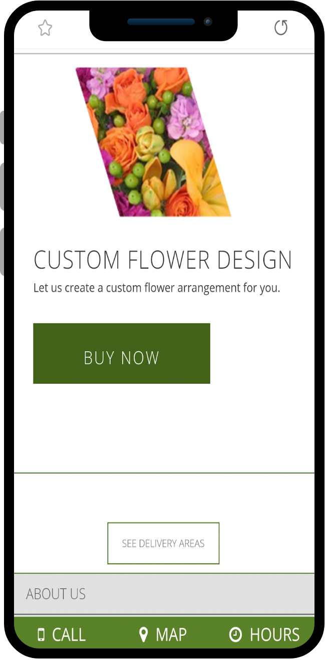
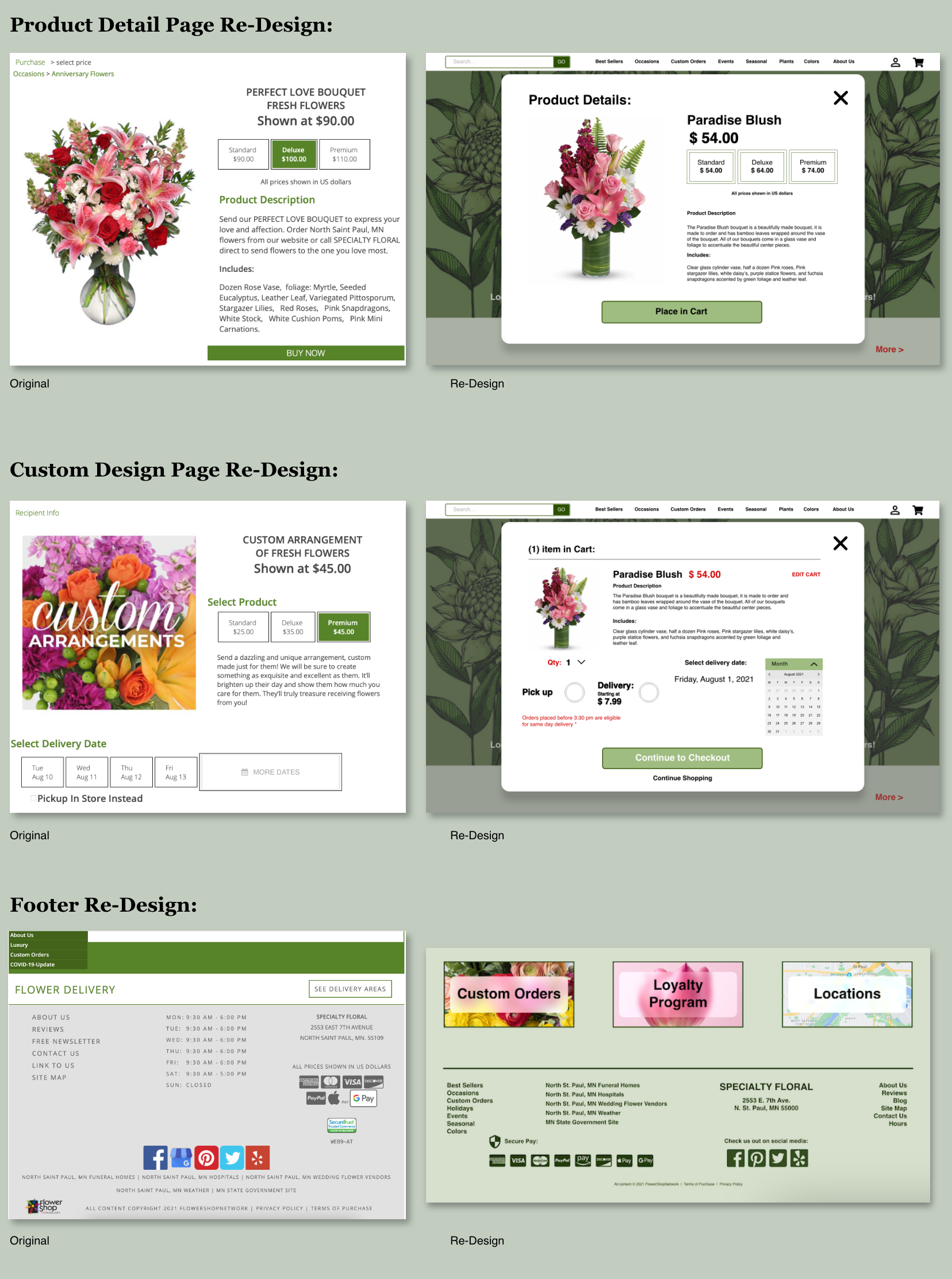
Re-Design Mockups
I re-design the custom design page with options to choose colors, quantity and a price range. My design thought process is that users would like to have an idea of what they're ordering and to be a part of the decision process which helps gives users a peace of mind when they can see what the potential item they’re ordering will look like.

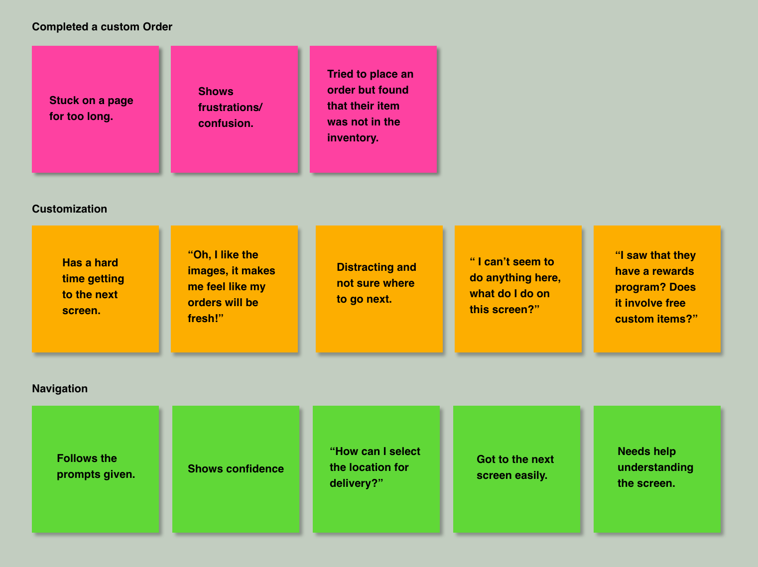
User Research:
Affinity Diagram
Personas
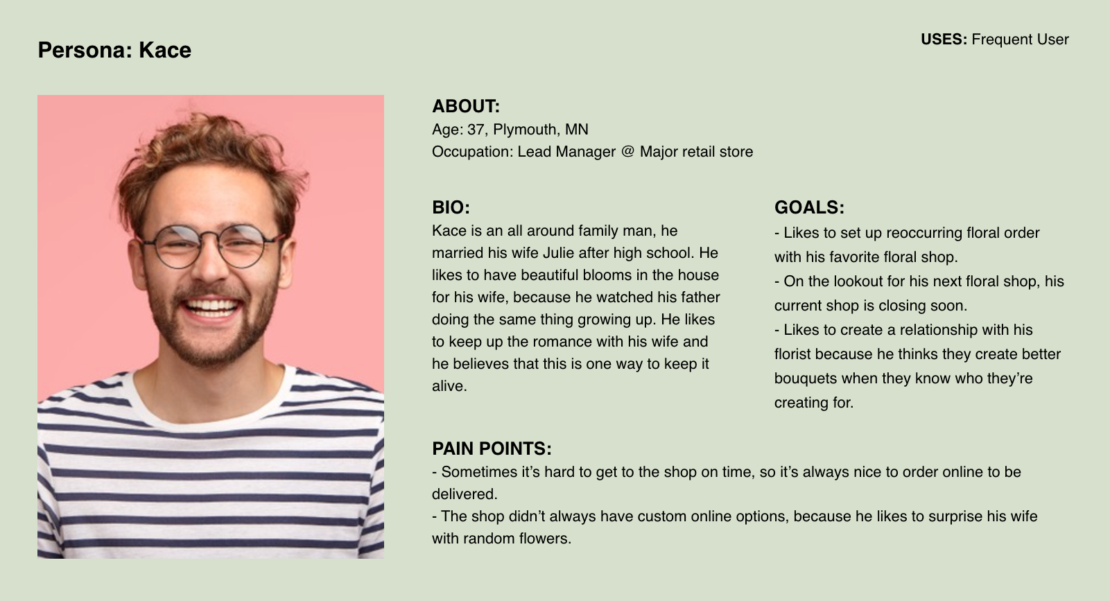

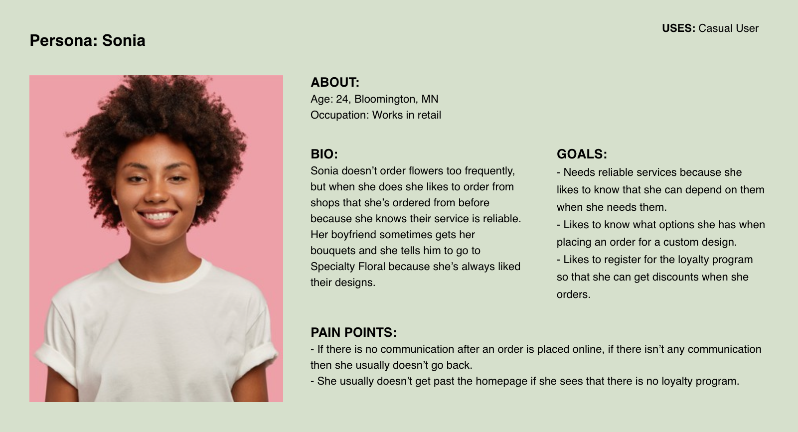
On approaching this problem it was crucial to gain a better grasp of Specialty Floral users and their interest in using the site/app.
What I found during my research into floral shops and what I gathered from users who have ordered from online floral stores:
1) Site had too much options and felt crowded that sometimes they feel like they can get lost or that they were missing out on other options because they weren't sure if they've browsed all the options available.
2) Online floral shops are too crowded and have too much information listed that it looks like a wall of script and makes them feel overwhelmed with the information overload.
3) Sometimes users have a hard time navigating through the site because there was no clear indication of hierarchy.
The Final Product
Retrospective:
I started this case study with the idea of creating a modern and trending floral shop, the core idea was to create an engaging user experience when ordering custom floral designs and ultimately giving users a peace of mind when they place their orders. I feel that I achieved the initial goal and it was nice to have a color scheme and direction in an existing site because it made the design process easier. I felt that this was a really good learning experience and something that I can use for future projects.
Had I had more insight into Specialty Floral, I would like to track metrics such as clicks, user flow when clicking on custom orders and the items they place in queue.
Other ways that I would like to measure success includes:
More usability testing: At what point are users exiting the site?
More user feedback testing: What are users behaviors and opinions?
Traffic Analysis: How are the users interacting with the new features?
And: Does the new changes effect the users likelihood to placing custom orders?

You've reached the end. What's Next?