

This case study for a user experience design made for social good, it is for a free educational language learning program called Language Learner. (😊 most creative name, I know!)


July 12, 2021 - July 19, 2021


UX designer leading the app and responsive website design from conception to delivery.
Responsibilities included conducting interviews, paper and digital wireframing, low and high fidelity prototypes, conducting usability studies, accounting for accessibilities, iterating designs, determining information architecture and responsive designs.

The goal was to create a free language learning program that would be engaging and exciting enough that it would retain users. Studies show that a lot of users from other language learning sites have shown steadying lowered class rates and registrations. After reviewing their sites the reason maybe due to user loyalty and communications. My aim is to create a learning site that is engaging and fun, to do that I will add an introduction course and voluntary partnership to create accountability and engage the user when they're logged in.
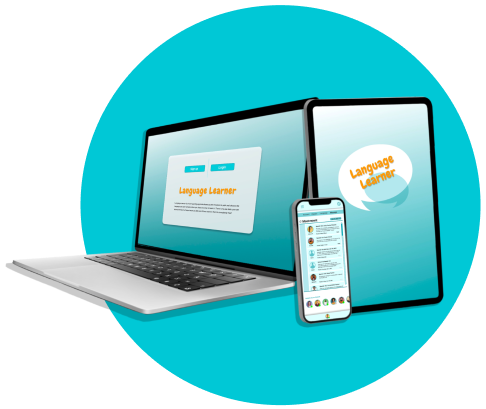
The objective of this project was to design a user experience for social good and accessibility, providing a smooth experience across all devices. Especially to design for progressive enhancement and graceful degradation, designing a consistent and cohesive experience across both mobile app and responsive website. Designing with the 4 C’s in mind: Consistency, continuity, context, and complementary. Also taking into consideration the context of the user situation and adapt the design for the way the users interact with each device.

This program is in direct competition with companies like Duolingo, Memrise, Busuu and Babbel plus many other sites which are indirect competitors like Rosetta Stone or Coursera. These companies all offer a language learning opportunity for users who want to learn a new language but choose to use a free program due to various financial backgrounds or language choices.

Design methods that I used in creating the user experience for my social good site was Ideate / Crazy 8 & How might We? exercises.
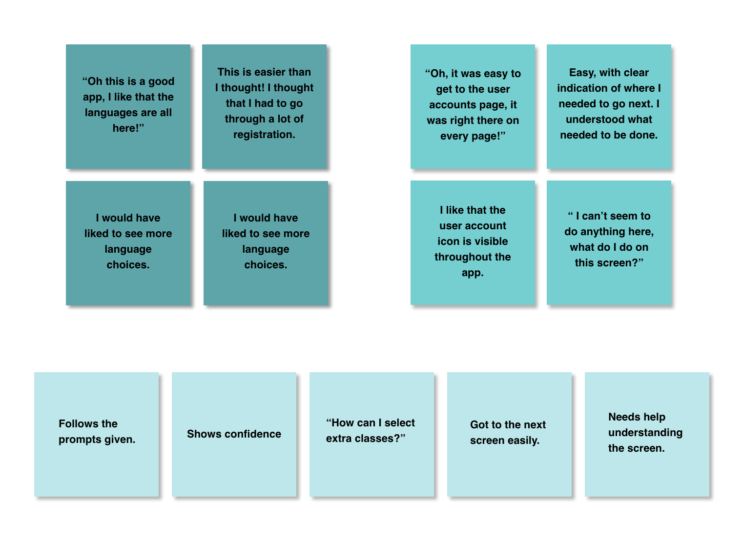
Survey Type: Unmoderated Usability Study
Location: Online
Participants: 5
Length: 30-45 min

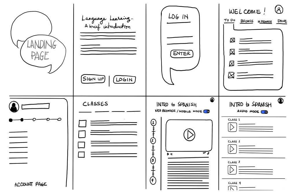
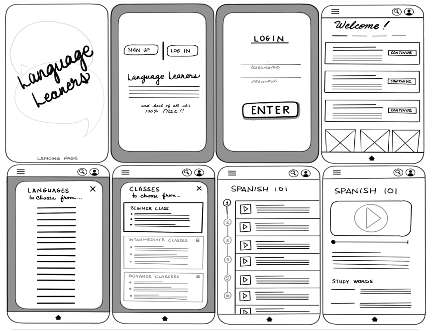
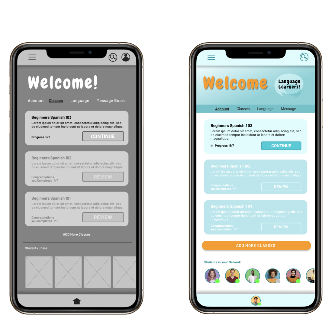
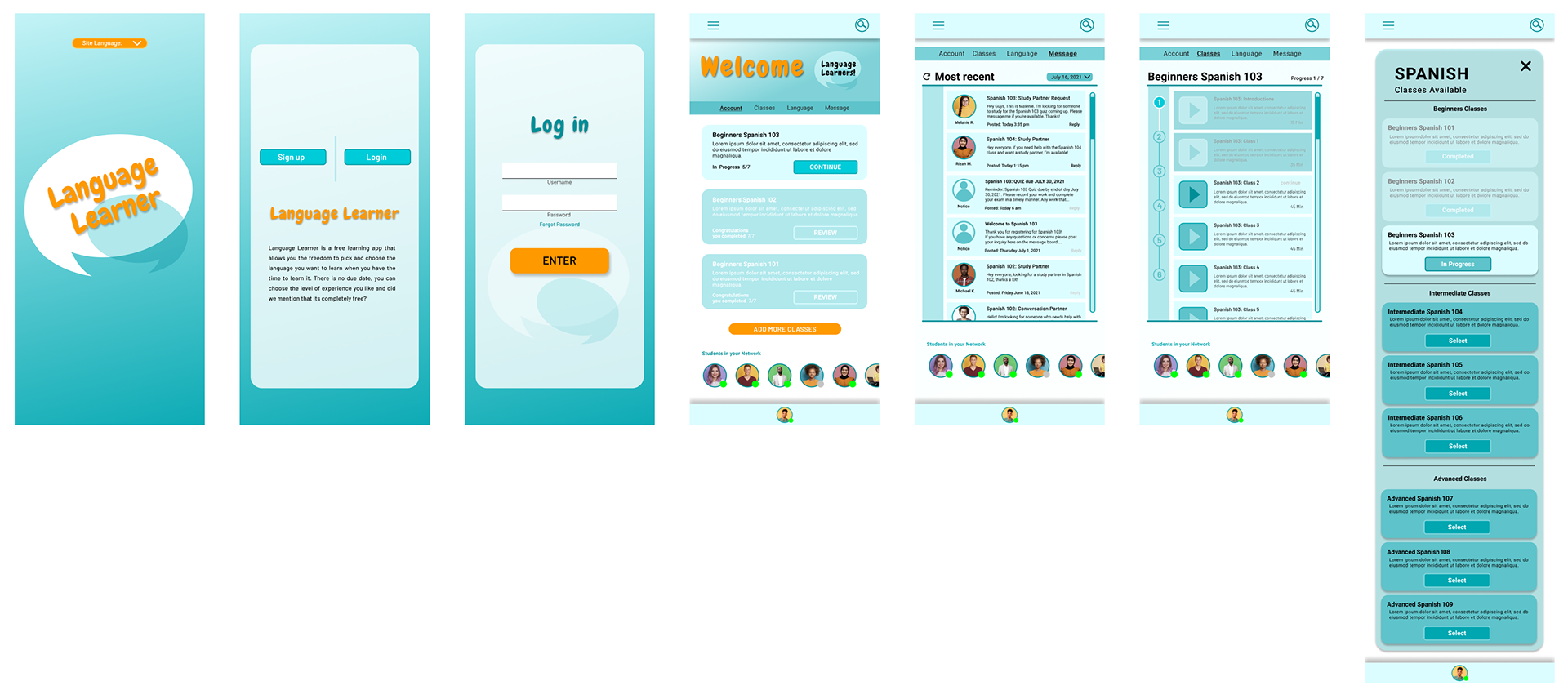
I did a quick ideation exercise that contained as much information as possible, but provide enough visual to guide the users through the design. My focus for this exercise was to keep the design simple enough for accessibility but provide enough information and to make the navigation flow easy.

Taking into considerations the four C's; Consistency, continuity, context, and complementary, I wanted to make sure that the images and information that I used will have accessibility across all platforms.
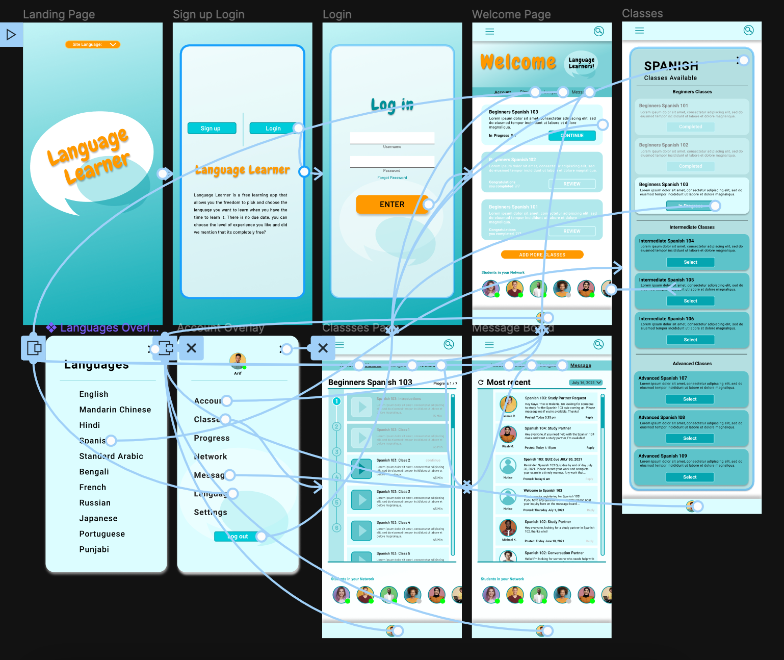
Digital wireframing

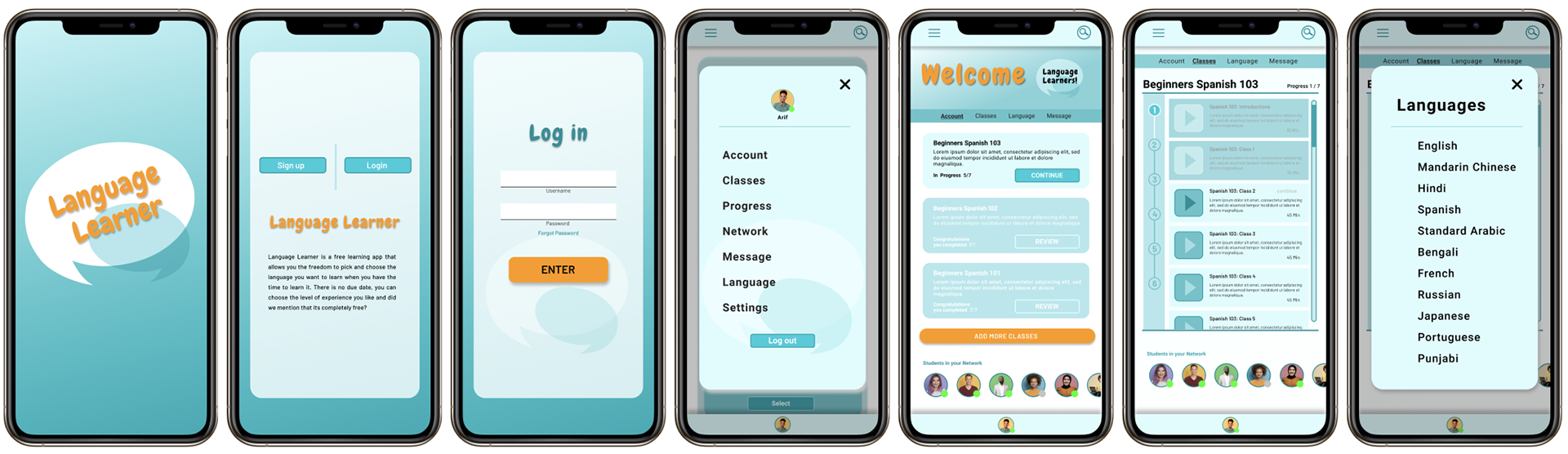
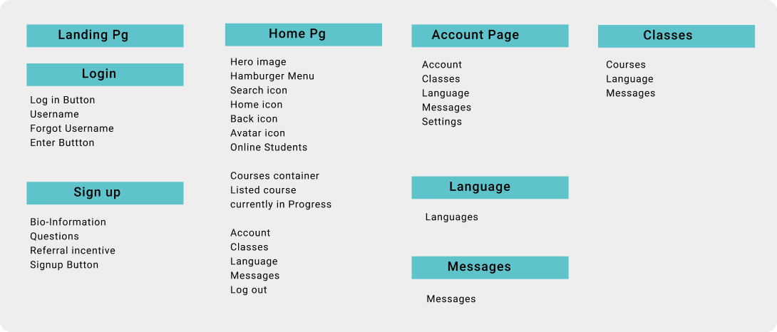
In preparations of creating my responsive design, I created a site map and a sticker sheet or visual identity sheet to narrow the theme to help me focus on my design style. I wanted a design style that would be fun and have bright refreshing colors and as always I wanted to keep the design simple.
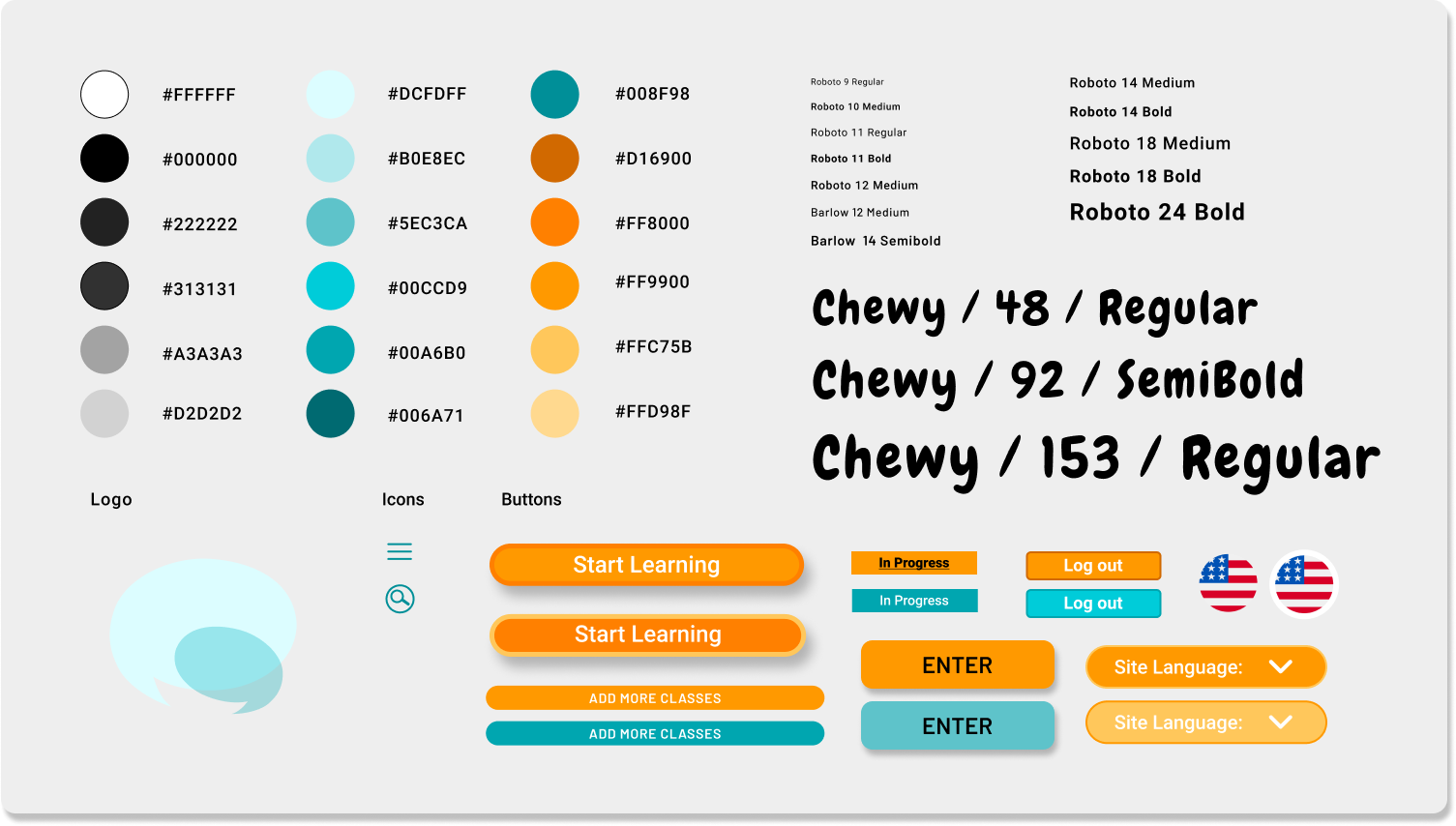
Visual Identity Sheet

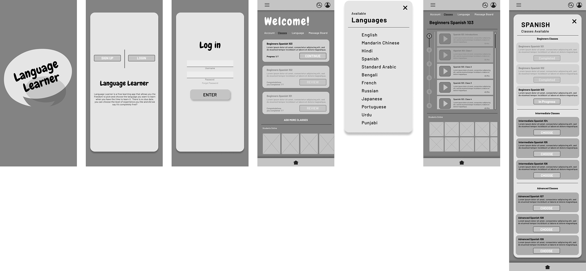
At this time prototyping was taking me the most amount of time; due to trying to incorporate new tips and tricks I learned. When I find any of the components and overlays not syncing well, I spent my time troubleshooting and fix it as best I can. This was repeated 100x, yet I feel that there are always room for improvement. This portion was the most challenging and educational overall, and yet I enjoyed this part of the design process the most.

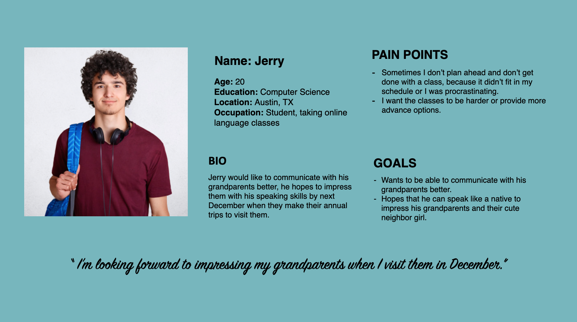
Personas

Competitive Audit
Direct Competitors:
Duolingo: www.duolingo.com (free with in-app purchases)
Babbel: www.babbel.com (free with in-app purchases)
Busuu: www.busuu.com (free with in-app purchases)
Memrise: www.memrise.com (free with in-app purchases)
Insight Identification
1. Once a user has successfully logged in, how long does it take users to get to their "in progress course". The insight is that it didn't take too long to get to their classes as it was the first page they were brought to after logging in.
2. Can users easily add new classes to their schedule? The insight is the option to add new classes to their schedule is provided on the homepage and account page. There are many ways to add classes easily to a users account.
3. Users don't have the motivation to learn a new language, to which the insight is: users can be motivated to continue learning when they see other students engaging in classes and they can hold each other accountable for their progress and call on each other for support to complete their classes.
Affinity Diagram


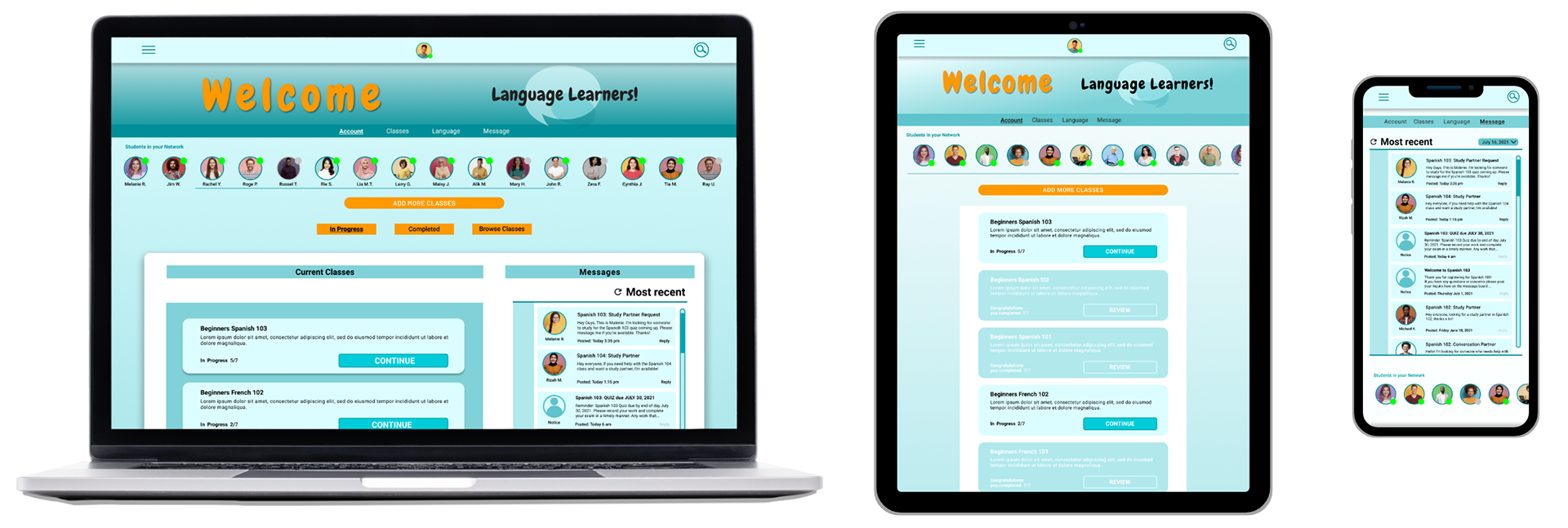
My focus here was accessibility and responsive designs using simple visuals and components; it was important for me to keep that focus in the forefront of my mind. I wanted to make sure that my designs would translate across multiple platforms, as well as designs that would make good use of negative space.

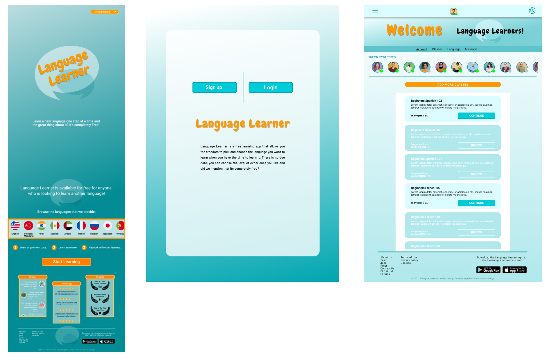
Designs shown are the responsive pages as it transitioned from webpage, to tablet to mobile.


The next steps for this app would be to add more languages and eventually have live classes that users can attend on a regular scheduled basis. This would be both engaging and add an immersive learning experience.

What I learned was that ultimately users want to be able to study at their own pace and to reach out to someone when they get stuck; that someone can be any other student in their network which is available for anyone who registered. In addition, providing Alt text and labeled forms helps other users know what to do next and so that navigation will be easier.

You've reached the end. What's Next?
Specialty Floral